Overview
The Base Apparel landing page is a "coming soon" page designed to give users a preview of the website's layout and functionality before it is officially launched. I built the page using HTML5, CSS, CSS Grid, Flexbox, JavaScript, and DOM. The responsive design ensures that users will see an optimal layout for their device's screen size. The page also includes hover states for all interactive elements, as well as error messages for incorrectly formatted or empty form submissions.
Links
Desktop version

Mobile version

Overview
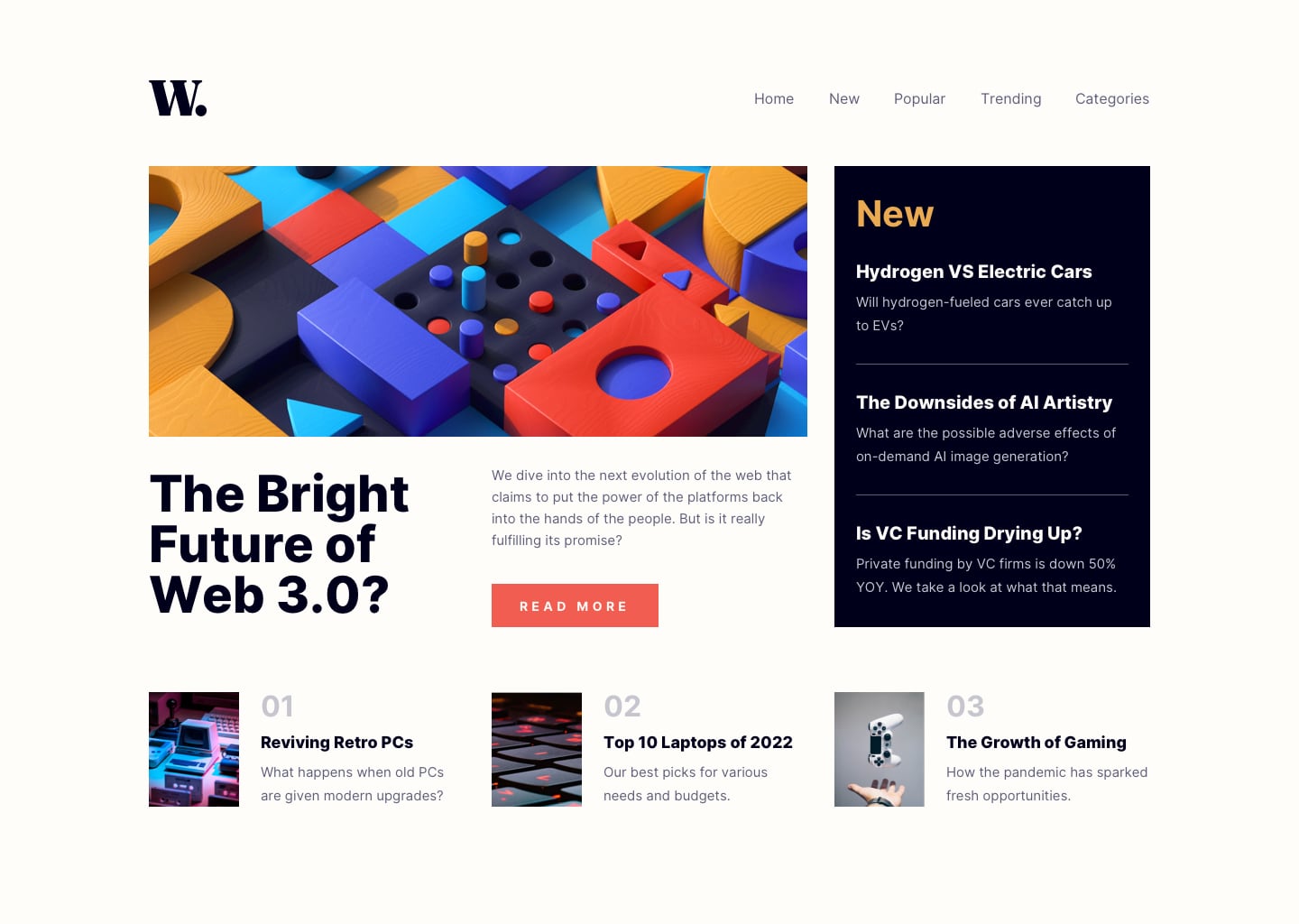
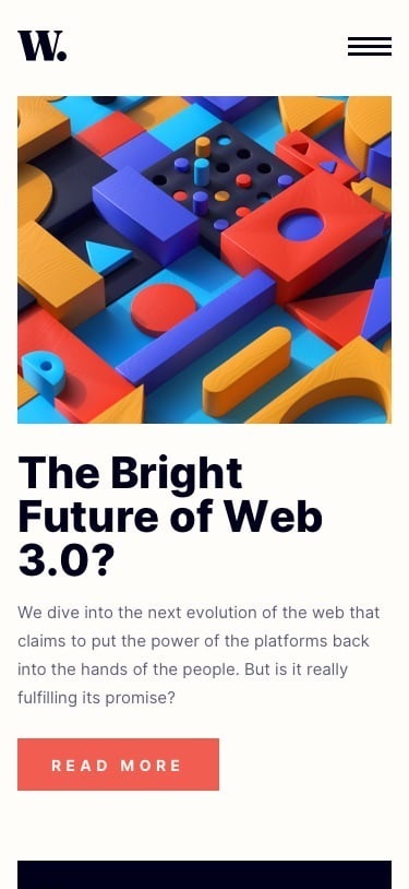
The News Homepage is a landing page for a website that provides users access to latest news about tech. I built the page using HTML5, CSS, CSS Grid, and JavaScript. The responsive design ensures that users will see an optimal layout for their device's screen size. The page toggles the mobile menu and includes hover states for all interactive elements.
Links
Desktop version
Mobile version
Overview
The is the Product preview card component. I built the page using HTML, CSS, and Flexbox. The responsive design ensures that users will see an optimal layout for their device's screen size.
Links
Desktop version

Mobile version

Overview
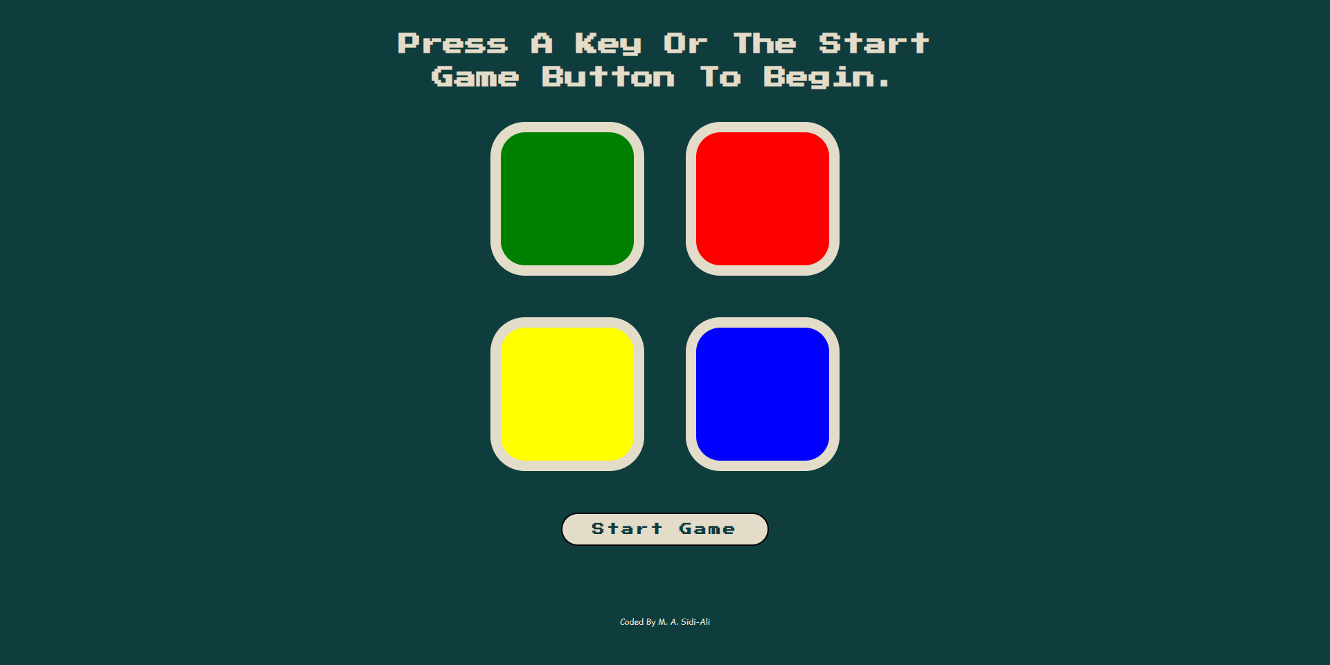
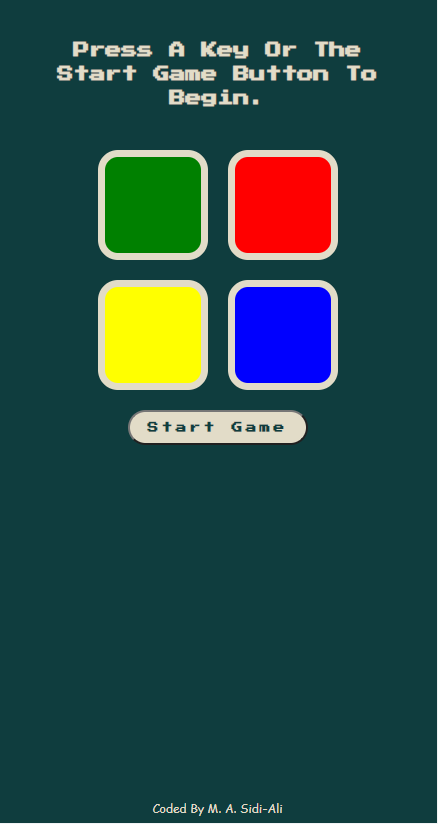
This is a digital implementation of the classic game known as the Simon Game. Players can initiate the game by pressing either the start button or any key. The game presents players with a sequence of tiles to click, which become increasingly complex as they progress through levels. In the event of an incorrect pattern, the game will notify players that the game has ended and they have the option to restart by pressing any key or the restart button. I built this game using HTML, CSS, CSS Grid, JavaScript, DOM and JQuery. The responsive design ensures that users will see an optimal layout for their device's screen size.
Links
Desktop version
Mobile version
Overview
Four Card Feature Section
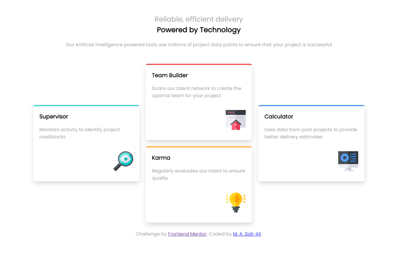
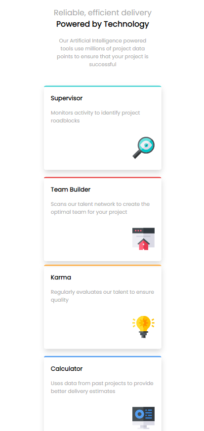
The Four Card Feature Section is a multicolumn and responsive layout-based challenge. I built this using HTML, CSS, and Flexbox. The responsive design ensures that users will see an optimal layout for their device's screen size.
Links
Desktop version
Mobile version
Overview
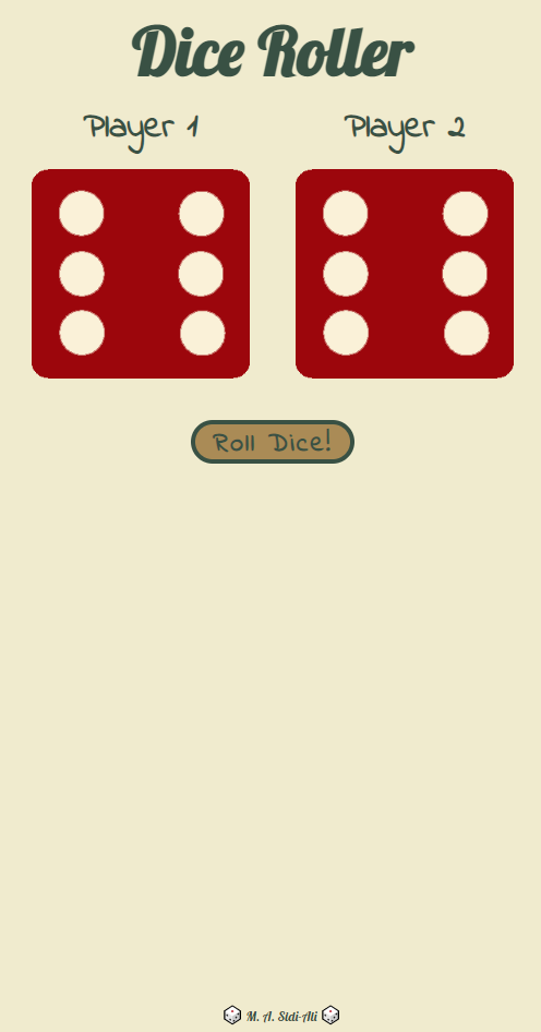
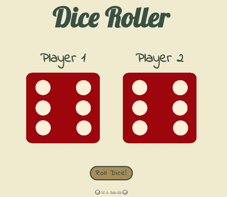
The is a dice game. It is a game of luck where the player that gets the highest number on a die wins. I built this game using HTML, CSS, Flexbox, JavaScript, and DOM. The responsive design ensures that users will see an optimal layout for their device's screen size.
Links
Desktop version
Mobile version
